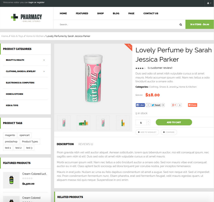

Adaptive web design, commonly known as <a href="https://www.empresadeserviciosweb.com/1-que-es-el-diseno-receptivo-aprendizaje-del-diseno-web-receptivo-book/" title="What is responsive design?">responsive design in English, is a design and <a href="https://www.empresadeserviciosweb.com/que-funcion-tiene-una-agencia-de-development-web/" title="What role does a web development agency play?">web development approach that seeks to provide an optimal <a href="https://www.empresadeserviciosweb.com/que-es-uso-de-deep-linking-para-mejorar-la-experience-del-user-desde-resultados-de-busqueda/" title="What is the Use of deep linking to improve user experience from search results">user experience across a wide range of <a href="https://www.empresadeserviciosweb.com/stripe-en-wordpress-es-la-forma-mas-facil-de-aceptar-pagos-en-linea-desde-devices-moviles/" title="Stripe on WordPress is the easiest way to accept online payments from mobile devices.">devices and screen sizes. .
I recommend you check out this article, which is interesting: <a href="https://www.empresadeserviciosweb.com/expert–seo–talavera-posicionamiento-local/" title="Your SEO Expert in Talavera de la Reina" class="internal-recommendation" target="_self" rel="noopener">Your SEO Expert in Talavera de la Reina.
Instead of creating multiple versions of <a href="https://www.empresadeserviciosweb.com/post/como-saber-que-plugins-usa-una-web/" title="How to analyze a website to see its plugins" class="internal-link">a website to adapt to different devices, adaptive web design uses techniques such as the use of flexible media and media queries (media queries) in CSS to dynamically adjust the presentation and layout of the content according to the characteristics of the <a href="https://www.empresadeserviciosweb.com/pedir-google-encuentre-device-android-encontrar-mi-dispositivo-localizacion/" title="How to Ask Google to Find My Device?">device and the screen resolution.
This methodology involves creating a single version of the website that adapts fluidly and elegantly to devices of different sizes and capabilities, from desktop PCs to tablets and smartphones.
By doing so, a consistent and satisfactory user experience is guaranteed, regardless of the device used to access the website.
Adaptive web design considers various aspects, such as design flexibility, image and media optimization, text readability, and intuitive navigation, to ensure that content is presented effectively on any device.
Furthermore, with the growing diversity of devices and screen sizes on the market, adaptive web design has become essential to ensure the accessibility and usability of web content in today’s digital era.