
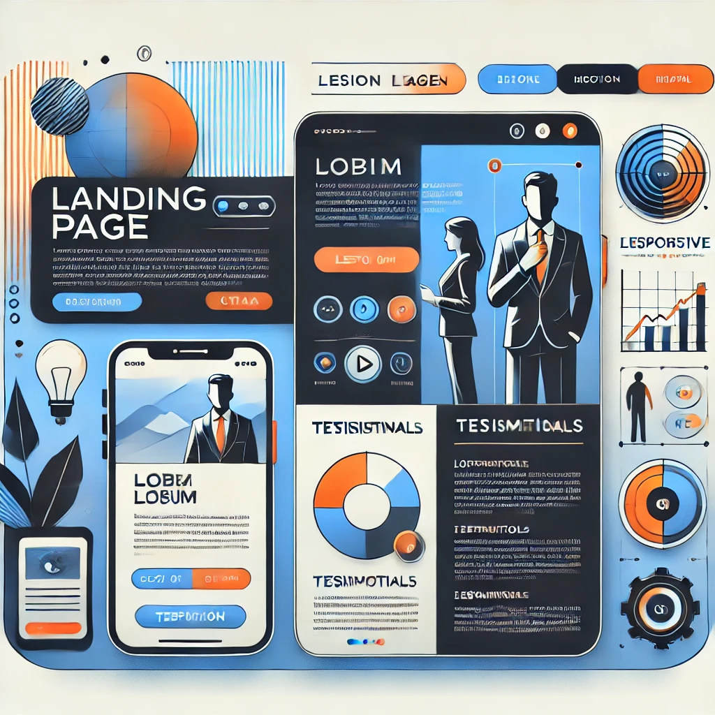
Landing pages have exploded in 2026, and it’s not just marketing hype. If you’ve been on LinkedIn, X, or any growth forum lately, you’ve seen the same phrase over and over: high-converting landing pages are the new homepage. And honestly, they’re right. A well-built landing page can turn a cold visitor into a paying customer in under 30 seconds — something a traditional website almost never does.
I’ve spent the last few weeks testing different builders and reading studies from Unbounce, HubSpot, and WordStream. The verdict is clear: companies that use dedicated landing pages see up to a 160% lift in conversion rates compared to sending traffic to a generic page. That’s not a small edge. That’s the difference between a business that scales and one that stalls.
Who Actually Needs a Landing Page in 2026
Short answer: almost everyone with something to sell, promote, or validate. But let’s get specific, because «everyone» is lazy advice.
B2B and B2C companies need landing pages to funnel prospects toward one single action — booking a demo, downloading a whitepaper, or starting a free trial. Without that focus, traffic scatters and conversions die.
E-commerce stores use landing pages for product drops, seasonal promos, or influencer campaigns. A dedicated page for a Black Friday bundle will always outperform a category page.
Freelancers and consultants — this one’s for you. A clean landing page with your offer, proof, and a calendar link replaces your entire sales funnel. I’ve seen solo designers triple their inbound leads just by ditching their portfolio site for a single-purpose page.
Startups validating an idea? Landing pages are your cheapest market research tool. Build the page before the product. If nobody signs up, you just saved six months and a lot of money.
Landing Page vs. Website: The Real Difference
A website is a department store. A landing page is a checkout counter.
Your website has a menu, an about section, a blog, contact info — dozens of exits. A landing page has one goal and zero distractions. No navbar links, no footer rabbit holes, no «related posts» that steal attention.
That minimalist approach is exactly why landing pages convert 2 to 3 times better than standard web pages. Every pixel on the screen should push the visitor toward the CTA. If it doesn’t, it’s noise.
How to Build a Landing Page That Actually Converts
Forget the pretty templates for a second. Conversion comes from structure and psychology, not aesthetics.
Step 1: Define one objective. Not two. Not «collect emails and sell.» One. A landing page with multiple goals is a landing page with no goal.
Step 2: Know exactly who you’re talking to. A page for SaaS founders looks nothing like a page for brides-to-be. Write like you’re speaking to one person, because you are.
Step 3: Nail the headline. Your headline does 80% of the work. «Double your sales in 30 days» beats «Improve your business performance» every single time. Specific numbers, clear outcome, no fluff.
Step 4: Keep the design stupidly simple. One column. Big CTA button. Contrasting colors. If a user has to think about where to click, you’ve already lost them.
Step 5: Add social proof. Testimonials, logos, star ratings, numbers of users. Trust signals are non-negotiable in 2026, especially with AI-generated content flooding every feed.
Step 6: Mobile-first, always. Over 70% of your traffic will hit that page on a phone. If your CTA is below the fold on mobile, you’re burning money.
Elements You Can’t Skip on a High-Converting Landing Page
- Short contact form: Three fields max. Every extra field costs you roughly 10% of conversions.
- Hero image or video: Show the product in action. Stock photos of handshakes are dead.
- Persuasive copy: Write like you talk. «Grab your free guide» beats «Submit your information» by a mile.
- Prominent CTA: One button, repeated three or four times down the page, always in a contrasting color.
- Loading speed under 2 seconds: Anything slower and Google penalizes you, visitors bounce, and your ad spend evaporates.
Mistakes That Kill Landing Page Conversions
I’ve audited dozens of landing pages this year, and the same five mistakes come up over and over.
Information overload. You don’t need to explain everything. You need to make one promise and back it up.
Cluttered layouts. Sidebars, pop-ups, chat widgets, cookie banners stacked on top of each other. Chaos kills trust.
Vague CTAs. «Submit» means nothing. «Get my free checklist» means everything.
Zero social proof. If nobody vouches for you, why should a stranger trust you with their email or card?
Slow load times. Compress your images, use a CDN, and test with PageSpeed Insights. A 1-second delay can cut conversions by 7%.
Best Tools to Build Landing Pages in 2026
You don’t need a developer anymore. These platforms handle everything from templates to A/B testing.
- Unbounce: Still the gold standard for conversion-focused pages. Smart Traffic feature alone justifies the price.
- Instapage: Best for teams running multiple campaigns at scale.
- Wix and Squarespace: Solid for beginners who want design and hosting in one place.
- WordPress + Elementor: Maximum flexibility if you already run a WordPress site.
- HubSpot Landing Pages: The obvious choice if you use HubSpot CRM.
- Framer and Webflow: Newer favorites for design-heavy pages that still load fast.
Advanced Tactics to Squeeze More Conversions
Already have a landing page but the numbers are flat? Try these.
Run A/B tests religiously. Test headlines, CTA colors, button text, image placement. Small changes often produce double-digit lifts.
Personalize by traffic source. Someone from a Google ad should see different copy than someone from a newsletter.
Use urgency — honestly. «Offer ends Friday» works. Fake countdown timers that reset every visit destroy credibility and get you flagged.
Add exit-intent popups. They recover 5-10% of abandoning visitors when done tastefully.
Track everything. Google Analytics 4, heatmaps, session recordings. If you’re not measuring, you’re guessing.
The Bottom Line
Landing pages aren’t a trend — they’re the conversion engine of any serious digital strategy in 2026. Whether you’re a startup founder, a freelancer, or running a full e-commerce operation, a focused landing page will outperform a general website every time.
Build one this week. Test it. Iterate. The businesses winning right now aren’t the ones with the prettiest sites — they’re the ones with the sharpest, most focused landing pages.